Things to avoid in presentations
Scientific presentation is an important part of doing research, but it is hard to captivate an audience. Conferences are great venues to disseminate ideas and get yourself known, so you have to seize your listeners’ attention. I list here ideas and observations I made during the last conference I attended to try to shed some light on common issues. Hopefully, someone can benefit from it; at least it helps me reflect on my own practice.
Point of this post
Through the years I have moved away from the “standard” Beamer template that you see much too often in conferences. I do not think that a presentation should be a translation of your paper into slides instead of pages. The goal of your presentation is to communicate the idea of the paper. I find myself too often sitting through talks on topics I am interested in, but incapable to engage. On the other hand, I know some amazing presenters who are able to teach me about their work, no matter how remote from my own.
As usual, this is going to be my personal opinion and in no way do you have to follow it. My slides are usually described as “clean” or “barren” depending on the commentator’s opinion. But I prefer it this way. I use slides as illustrations to anchor my narrative; you should not be describing your slides.
I will be talking about the pitfalls in slide-decks I see most often in talks I attend and try to highlight them against what I see in good talks. I am not talking about language fluency, voice projection, body language or awkwardness – I come from computer science after all.
Things to avoid
- Large result tables: Highlight the key findings as either lists or small graphs; if you do use a table, always highlight the main results.
- No table of content: Present your talk’s layout orally and use segue slides. My pet peeve I would say, every talk where the speaker starts by reading her table of contents, I know will not be good. If you must have an outline slide, put it after the context.
- Stick to time: If your presentation is too short, no one will mind; you will annoy participants otherwise. Oh, and if the chair signals that your talk is over, it is. Most chairs are too polite to physically interrupt the speaker – they should.
- Remove headers and footers from slides: You need to acknowledge your affiliations, project, university of residence and the like, but keep it to the title and thank you slide, perhaps segue slides as well. In a nutshell, reduce clutter. Your data, bullet points, should have as much screen space as possible. This includes number of slides, outline, slide title banners, logos, etc.
Mathematical expressions
I think mathematical expressions, equations in particular, are a point worth improving. I work in operations research, mathematical modelling is at the core of my work, and yet I have removed every equation from my slides. I usually will explain them in a bullet list with a textual description. The paper is there to provide the actual maths.
In some cases, with a specific audience you can pull it off with almost black-and-white equations. Recently, I have seen people use graphical explanations of their equations as support. As always, this is a non-negligible amount of work but it truly helps.
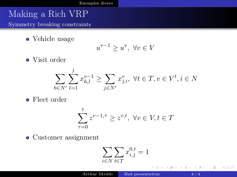
Let us see an example. The first one is a standard beamer presentation with the equations pulled from the paper.

This slide is bloated and at the same time shallow: there is little information of value for the listener, yet it is hard to read.
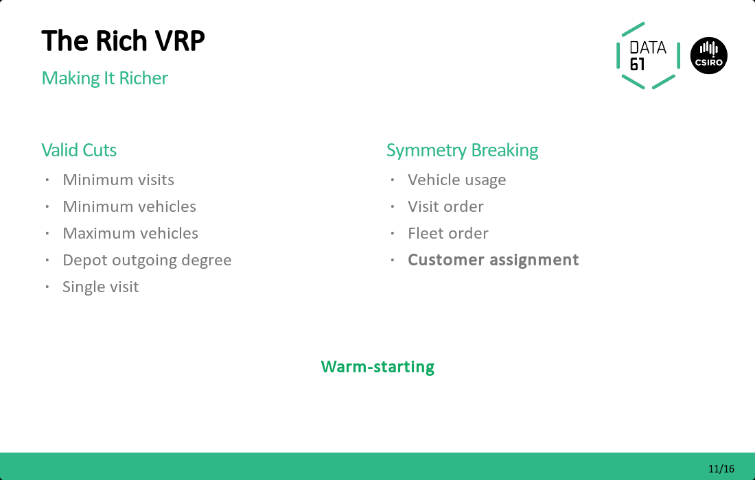
I started using HTML based templates early on as I always found that LaTeX, although excellent for typesetting, did not do the job for visual content presentation.

This slide is much more information-dense, but it fails to draw the attention to key elements – in this case I did not find them that important for the talk.
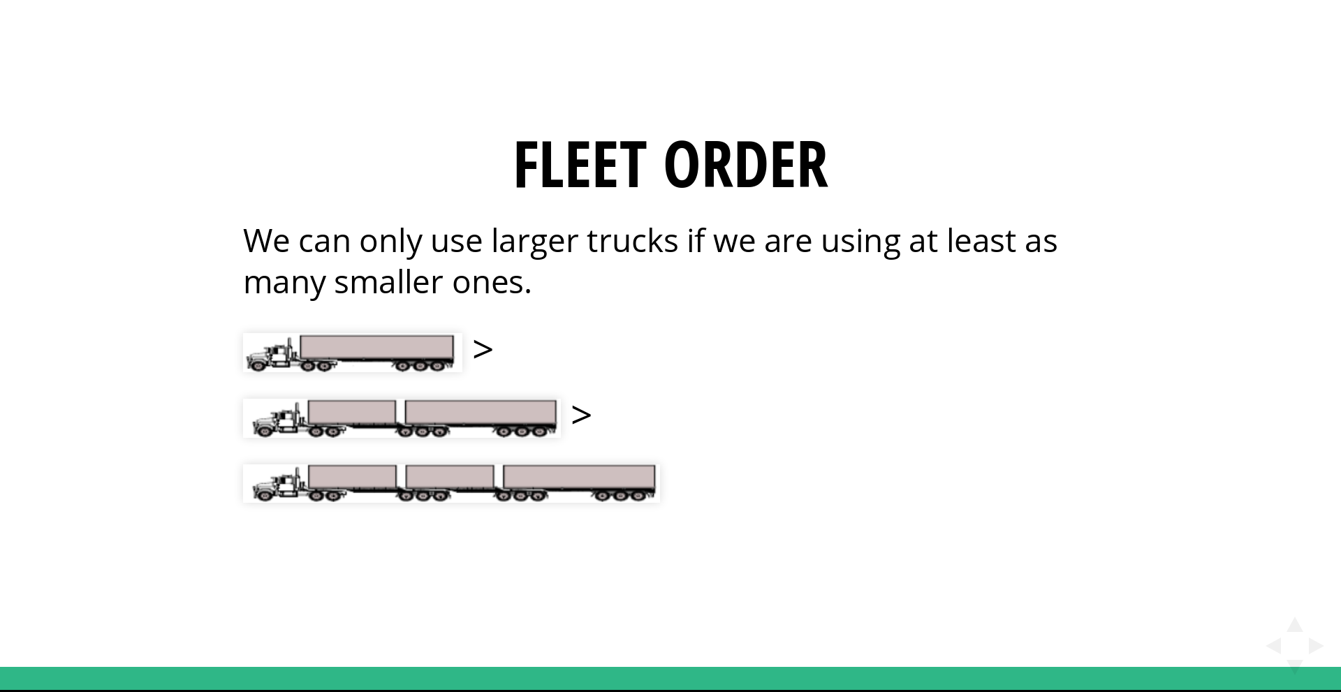
Nowadays, this is how I would write a slide about a constraint of note.

This was done for this post so I am not sure I would use this very slide – and the images are not pretty. But I hope you get the gist: supporting text, clear pictorial representation of the concept, content uses the whole area.
Things to do
- Having a small example: What better way to convey your ideas than have a small example? It allows you to go through the key points of your research without having to deal with the hairy details, which are then relegated to questions.
- Visual explanation: If you talk about a concept which can be interpreted graphically, use an illustration or a diagram.
- Mention key difficulties: Instead of having one (heavy) slide per difficult thing you did, give an overview of the work and mention what the hard bits were. It allows you to lighten the slides and makes room for questions.
All in all, doing the good things will end up being more time consuming. However, a piece of advice I received from an outstanding researcher was:
For every bad talk you give, you must give at least nine good ones to make up for it.
In parting
Research talks are key to research. I just attended a high-profile conference, and I could see all the professors at the top of the field being 100% engaged in the talks. This is where they get ideas, they scout people, they keep up with the field. Scientific communication is becoming more competitive every year, and, especially in a field such as mine, it is often downplayed. Or rather, it takes time to actually fathoms how important it truly is.
If you think this does not apply to you as your field is different enough, or you are a good presenter, etc. Please ignore this. But I still suggest you go back to some of your recent slides, have a hard look at them and ask yourself if there is a more intuitive, clearer, or different way you can communicate your point while avoiding one of the pitfalls I listed.
Making presentations is a task few people I know genuinely enjoy. It is a shame as I learn a lot during good presentations. But, making a good one requires quite a bit of work. In parting, I hope you either learned something or reflected on your practice and leave you with a few pieces of advice to make things faster:
- Having a (reproducible) template will make your preparation faster.
- Make your figures for the presentation instead of reusing those from your paper. (I use Org Mode’s
srcblocks.1)